
The "Invisible Wall": Why Your Website Might Be Quietly Driving Customers to Your Competitors
Let’s play out a scenario that happens thousands of times a day.
A potential customer wakes up, realizes they have a problem, and goes online to find a solution. Maybe their roof is leaking, their car is making a terrifying grinding noise, or they need to order 500 custom metal stampings for their factory.
They find your website. They click on it. Your business is incredible, your team is highly skilled, and your customer service is unmatched.
But within ten seconds… they leave. They click the “back” button and end up hiring your competitor down the road.
What just happened? Your business didn’t fail them, your website did. It had an Invisible Wall.
In the tech world, we call this a “poor UI/UX” (User Interface/User Experience) problem. But in plain English, it just means your website is too frustrating, too slow, or too confusing for a regular person to use.
The 3 Warning Signs Your Website is Frustrating Your Customers
Most business owners don’t realize their website is losing them money because they already know how to navigate it. To see it through a customer’s eyes, watch out for these three major pitfalls:
1. The "Where is the Button?" Mystery
Imagine walking into a grocery store, filling your cart, and realizing there are no cash registers, no signs, and no employees in sight. You’d leave your cart and walk out, right?
If a customer has to scroll through five pages of text just to find your phone number, a quote form, or an appointment link, they will give up. If it’s hard to find, it doesn’t exist.
2. The Overwhelming "Wall of Words"
When you are an expert at what you do, it’s easy to get excited and fill your website with technical jargon, deep industry history, and massive paragraphs of text. But busy customers don’t read websites, they scan them. If they are greeted by a wall of dense text, their brains get tired, and they bounce away.
3. The 1990s Loading Speed
We live in a fast-paced world. If your website takes more than three seconds to load on a smartphone, your customer has already moved on to the next Google search result. A slow website tells a customer that your business might be slow, too.
Real-World Example: The Local Eye Clinic
To see exactly how much an “Invisible Wall” impacts a local business, let’s look at the eye care industry. When someone breaks their glasses or realizes it’s time for their annual eye exam, they want to find a local doctor, verify the location, and book a visit quickly.
Example A: The Superior Experience (Michigan Street Optical)
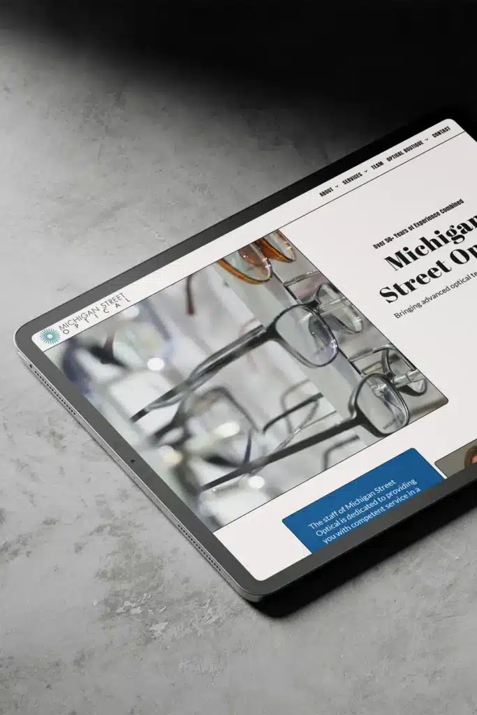
Let’s look at how web design should work by examining the digital home of Michigan Street Optical – Designed and Developed by Capital Web Development
Instead of throwing up technical roadblocks, this website completely rolls out the red carpet for the user:
-
Instant Visual Clarity: The moment the site loads, the visitor is greeted by a crisp, beautiful, and minimalist layout that instantly screams high-end professionalism and trust.
-
Zero Mobile Guesswork: Crucial details, like their phone number and physical location, are prominently placed right at the top of the page. On a mobile device, a customer can tap the phone number to call instantly or tap the address to automatically open directions in Google Maps.
-
The Effortless Conversion: Instead of making patients dig through complex text menus, the site features a bright, unmistakable “Schedule an Appointment” button. Clicking it pulls up a fast, step-by-step online scheduler that allows a user to lock in a slot in under a minute.
Example B: The High-Friction Blueprint (Gates & Fences)
To see what a real “wall of text” looks like, open a live website like Gates & Fences. When a visitor lands on this page, they are immediately bombarded with an overwhelming, chaotic flood of tiny text, clashing colors, and hundreds of unorganized links packed tightly together. There is no clear, clean path for a shopper to get a quote, find a phone number, or browse photos. If a user tries to open this on a smartphone, they are forced to pinch, zoom, and horizontally scroll just to read a single line. Because the user experience is so frustrating, most modern shoppers will close the tab within seconds and look for an easier option.
How to Tear Down the Wall (Without the Tech Headaches)
Fixing your website shouldn’t feel like learning a foreign language, and you shouldn’t have to spend your weekends playing tech support. You have a business to run!
That’s exactly where we come in.
Since 2007, Capital Web Development has been helping businesses take the stress out of the internet. We aren’t just a design studio, and we aren’t just coders, we are your all-in-one, lightning-fast digital partner.
We have spent nearly two decades taking complex, messy, or outdated websites and transforming them into smooth, reliable tools that customers actually enjoy using. We handle everything from the initial strategy and beautiful, scannable layouts to the heavy-duty coding and lightning-fast hosting.
When you work with us, you don’t have to worry about the tech talk. We do the heavy lifting so that the phone rings, the quote requests pour in, and your business can do what it does best.
Is It Time for a Digital Tune-Up?
If you suspect your current website is quietly turning away business, let’s take a look at it together. We’ll show you exactly where the friction points are and how we can turn your digital presence into your highest-performing asset.